OAK & OLIVE
Project Overview
Oak & Olive is a conceptual restaurant brand built around warmth, freshness, and approachable Mediterranean-inspired dining. The project combines handcrafted character with a polished visual system, creating a brand that feels inviting, memorable, and easy to extend across packaging, signage, menus, social media, and digital ordering.
The goal was to create a restaurant identity that feels friendly and distinctive without becoming too playful or too formal.
The Challenge
The challenge was to build a food brand with personality while still keeping it clean, practical, and recognizable. Oak & Olive needed to feel charming enough for casual dining, but refined enough to work across real restaurant applications.
The identity also had to stretch beyond a logo. It needed to support takeout packaging, cups, sandwich paper, window graphics, app screens, social promotions, and in-store branding while staying consistent.
Creative Direction
The creative direction was inspired by neighborhood cafés, vintage food packaging, hand-drawn restaurant mascots, and modern casual dining brands.
Warm colors, organic shapes, simple illustrations, and friendly typography helped create a brand that feels fresh, relaxed, and full of character. The visual tone is casual but intentional, with enough charm to stand out in a crowded restaurant market.
Identity System
The identity system was built around a recognizable logo, supporting mascot illustrations, pattern elements, and flexible brand graphics.
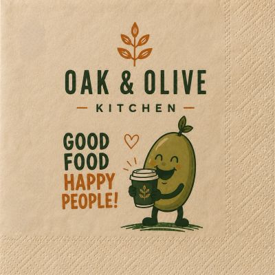
The mascot adds personality and gives the brand a more memorable customer-facing voice. Supporting patterns and illustrated details help extend the identity across packaging and promotional materials without relying on the logo alone.
Packaging & Applications
A major part of the project focused on how the brand would live in the real world. The identity was applied to sandwich wrap, takeout boxes, cups, napkins, bags, signage, window decals, and delivery app mockups.
These applications helped turn Oak & Olive from a single logo into a complete dining experience. Each piece was designed to feel connected while still serving a practical purpose.
Digital Extensions
Oak & Olive was also expanded into social media graphics, delivery app concepts, and digital promotional layouts.
The digital pieces kept the same warm, playful tone while making the brand feel current and easy to use. The system was designed to work across both in-person dining and online ordering.
Final Outcome
The final result is a complete restaurant identity system that balances charm, clarity, and flexibility.
The project highlights strengths in:
- Brand identity
- Restaurant branding
- Packaging design
- Mascot design
- Typography
- Pattern design
- Environmental graphics
- Social media design
- Digital application design
- Visual storytelling
By extending the project across packaging, signage, digital ordering, and in-store materials, Oak & Olive became a fully developed restaurant brand with a clear personality and a flexible visual system.